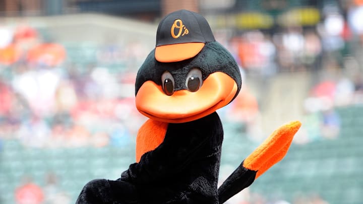
For almost fifty years, the iconic Orioles Bird has been the mascot of the Baltimore Orioles and the face of baseball in the city. He rallies Birdland behind him through his cheerfulness and uncompromising team spirit.
Besides the physical, huggable mascot, the Orioles bird has been given several artistic interpretations displayed on the team logo and uniforms. Some of these designs, though not officially used by the franchise anymore, continue to be beloved by fans and used to sell merchandise. Other iterations of the bird have been lost to time (which might be for the best). This list will look at each of those Orioles Birds, in order from worst to most appealing and enduring.
Shoulder Patch Bird (1955-62)
This bird is haunting. Its lifeless eyes and white face make you feel like you’re looking at a ghost, or perhaps the mascot for possessed zombie baseball players. As the name implies, this bird was worn on the shoulder of Orioles players’ uniforms. All in all, this bird is a far cry from the lovable Orioles Bird we know today.
The Decker Bird (1964-65)
By 1964, the Orioles had established themselves as major contenders in MLB. To convey their status, they came out with a more intimidating logo. The circle around the bird, combined with the font chosen, gives the impression of amateurish graphic design. As for the bird, we can’t even see his face clearly. A scraggly bird like that isn’t imposing enough to ever be intimidating. Instead, he just comes across as mildly unnerving.
The Cuckoo Bird (1968)
To be honest, I fear for my life after posting the Cuckoo Bird this low on the list. I mean just look at him. This bird debuted after a disappointing season in 1967 in an attempt to amp up the Orioles’ fan base. Instead, they just made a mascot that looks like a meme created by a bored college student. The Cuckoo Bird has a special place in the hearts of Birdland residents, but it definitely wasn’t the best decision to make it the face of the franchise.
The Lifelike Bird (1998-2008)
Is this a baseball team or a Nature Reserve? The Lifelike Bird is an updated version of the Ornithologically Correct Bird, which represented the O’s for the previous eight seasons. Unlike its predecessors, this bird has its feathers outlined and more realistic eyes. It’s a solid design, but not really befitting a baseball mascot.
Chirping Bird (1964-65)
In 1963, the O’s simply wore a letter B on their uniforms. The following year, though, the bird returned. The Chirping Bird gets its name from its expression; its beak is open, suggesting that the bird is chirping, most likely in support of its home team. The design is fairly middle-of-the-road; it’s not outstanding, but it's endearing enough.
The Ornithologically Correct Bird (1989-97)
This bird is something like a middle ground between the Chirping Bird and the Traditional Bird. It has more details and developed colors than the Chirping Bird but is still simplistic and appealing in a cartoonish way. The MLB describes it as a design that "Bird" fans and bird watchers could both appreciate.
The Traditional Bird (2008 - 2011)
This bird made its debut by adorning the O’s road jersey in 2008. It’s sort of a happy medium between the Lifelike Bird and the Ornithologically Correct Bird. It has a sleeker, more simplistic design that makes it more akin to a Baseball logo as opposed to a birdwatcher club logo.
Cartoon Bird (1966-89) & (2012-present)
The Cartoon Bird is arguably the most memorable Orioles logo in franchise history. It was the bird worn by some of the team’s all-time greatest players, including Brooks Robinson, Boog Powell, Earl Weaver, and Cal Ripken Jr. After taking a hiatus, the Cartoon Bird returned with a revamped look in 2012 and has been featured on the O’s uniforms ever since.
The Hartzell Bird (1954-64)
The original Baltimore Oriole was drawn by Jim Hartzell of the Baltimore Sun. The Hartzell Bird was featured on several Orioles logos with a few touch-ups (i.e. flipping it sideways, lowering the waving wing). The design invokes feelings of nostalgia just by looking at it; it’s adorable to look at and harkens back to the Golden Age of Baseball.
Walsh Bird (1966)
Despite only being the Orioles’ official logo for one year, the Walsh Bird continues to be one of the most iconic designs the Orioles Bird has ever had. It was designed by legendary illustrator Stan Walsh, the same man who created the Hamm’s Bear and Rice Krispies’ Snap, Crackle, and Pop.
This bird led the O’s to the 1966 World Series. The Walsh Bird is also the design that most resembles the physical Oriole Bird mascot, which perhaps is what keeps it so fresh in the minds of Birdland.
What do you think of these rankings? Do you agree? Is this the worst list you've ever seen? Let us know in the comments!
